“If it never rained, we’d have great water quality in Iowa.”
-Jim Richardson
“If it never rained, we’d have great water quality in Iowa,” joked a volunteer at our May 15 water quality snapshot. 15 of us spent the morning testing Ioway Creek and its tributaries in Boone, Hamilton, and Story County and were marveling at the low nitrate levels and crystal clear water at the majority of our sites.
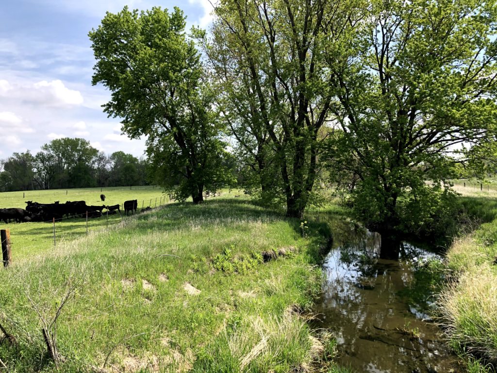
I wish more creeks in central Iowa were like this spot in Boone County. Cows fenced out the creek, a CREP wetland upstream keeping nitrate levels low, orioles and a kingfisher flitting between the trees.
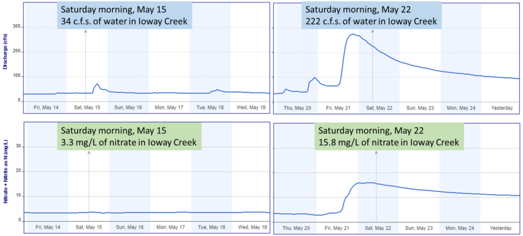
Well, we’ve had some much-needed rain in the week since, and water quality has gone from good to bad. I’ve written before about “weather whiplash” that explains some of the big swings in nitrate over the past decade and here’s an early hint of it. Here’s data from a nitrate sensor in Ioway Creek installed by IIHR-Hydroscience and Engineering. A five-fold increase in nitrate concentrations in just one week! The water has gone back down but the nitrate levels are still above the drinking water standard.
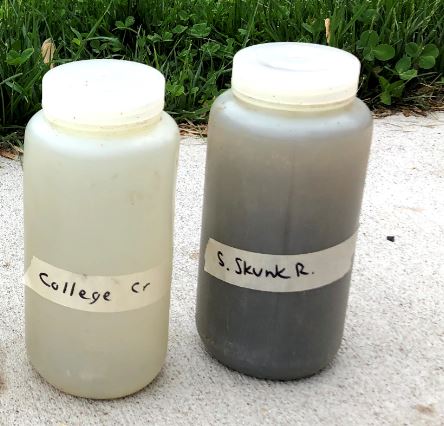
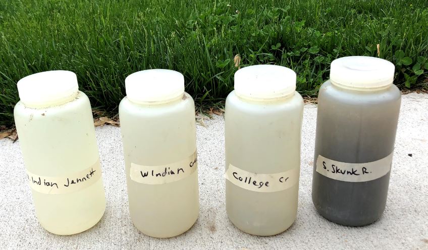
And here’s some water samples I collected on Friday May 21. No, that’s not my coffee thermos, that’s some of the world’s best top soil washing down the Skunk River!
Four samples collected May 21, after a 3/4 inch rain
That’s not to blame the weather. It does rain in Iowa and if your farming practices let a plume of topsoil, manure, or fertilizer wash off the field every time that happens, you’re doing it wrong! Some farmers are doing it right (I saw some cover crops this spring near Nevada and lots driving on I-80) but not enough, especially in the Ioway and South Skunk River watersheds.
Water quality monitoring has been top of mind for Prairie Rivers of Iowa lately and I see an challenge and an opportunity. It’s a challenge to interpret data and track our progress when one good rain can cause water quality to go from clear to coffee-colored overnight! There’s an opportunity to be more strategic about how and where we test, so we notice and communicate more eye-opening moments like this one, and hopefully persuade a few more people to protect soil and water.
Update: June has been abnormally dry and Hamilton, Boone and Story County are experience severe drought. Droughts stress is impacting crops and smaller streams are drying up.
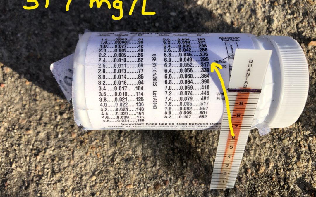
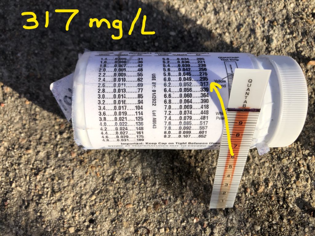
When snow melts, salt applied to melt snow on sidewalks, roads, and parking lots can make its way to streams. Freshwater critters don’t like living in saltwater. Are we getting to a point where they’d have trouble? Not quite, the chronic levels of concern for Iowa is 389 mg/L of chloride, and this sample (from a creek near Ames High School) and some others in our area were just shy of that last weekend. But be mindful of how much salt you’re scattering if we get some more icy days this month–people often apply more than what’s needed for safety!
The Izaak Walton League’s Winter Salt Watch is a good way for people to check on water quality during the winter and learn more about the issue.
What else is being carried in snowmelt? Our lab tests from late February are showing higher nitrate and bacteria levels than January’s tests. Check back in mid-March and we’ll get that data organized.
Learning the name of a person is a first step to building a relationship with them. It’s the same way with natural features. Learning to distinguish and name Iowa’s species of trees and wildflowers helped me me deepen my awareness of the landscape and seasons. That’s the thinking behind the road signs we helped Story County install, marking the creek crossings and watershed boundaries. Once you know the name of a creek and where it flows, you pay a bit more attention to it. If you begin to see the creek as something more than a garbage dump or drainage system, maybe you’ll take some steps at your home, farm, or business to make the water cleaner.
Now, the name of one of those signs is a word that is disrespectful to Native Americans. We apologize for perpetuating its use. We are delighted to hear that the U.S. Board of Geographic Names has approved changing the name of “Squaw Creek” to “Ioway Creek.” We commend the Story County Supervisors, Ames City Council, and others who pushed for this issue. It will take a little time and effort to change the signs, the logo and legal documents for the Watershed Management Authority, and our habits, but it’s a necessary and overdue change.
Time to replace some road signs. It’s shows respect and is not that big a hardship.
If you’re inclined to roll your eyes at this “political correctness,” hear me out. My white Norwegian-American elders did not share stories of racism and oppression, but they did teach me about pride in our heritage and showing respect for others. And since I have a hard-to-pronounce last name, I understand that when people take the trouble to get a name right, it’s a sign of courtesy.
The settlers who adopted the word “squaw” for place names did not take the trouble to get it right. According to a group that works to preserve indigenous languages:
“Squaw” is not an Indian word. It was probably invented by European colonists who could not pronounce a longer Indian word… The likeliest thing is that those original colonists were not being insulting and were just trying and failing to use an Indian word for “woman.” … However, since then the word has been used in a very racist and sexually abusive way, so it definitely has negative implications now.
-Native Languages of the Americas
Here’s a little thought experiment for white Iowans who enjoy, as I do, the celebrations of Dutch heritage in Pella, Norwegian heritage in Story City, etc. Imagine that there was no-one of Norwegian heritage left in Story City. Imagine they had all been killed or driven out generations ago, and there was no one left there to celebrate Syttende Mai, or paint rosemaling, or roll lefse, or bake sandbakkels. Imagine that instead of being celebrated in the town square, those customs had been suppressed by the US government and religious schools, and had only recently been revived by my Norwegian-American community in exile. Suppose that all that remained to acknowledge that Norwegian immigrants once lived here was a creek or housing development named “Sunbucker,” a corruption of the dessert “sandbakkel”, now understood to mean “those backward people.” Suppose I’d grown up being called a “Dirty Sunbucker” or worse because of my ethnicity. How would I feel about these place names? Uff da! Would I appreciate if people showed me the courtesy of using Norwegian words correctly, and talking about my ancestry without resorting to crude stereotypes? You betcha! It’s a silly analogy for a traumatic history, but you get the point.
At this point the etymology of the word “squaw” is beside the point.
“It’s not a positive term. The continued use of it is not appropriate and disrespectful to the people of native tribes.”
-Lawrence Spottedbird, executive director at Meskwaki Nation, as quoted in the Gazette
If you can bring yourself to change your seed cap from “Monsanto” to “Bayer” over a corporate merger, surely you can get used to saying a different creek name to show a little more respect for the people who used to live in Story, Boone, and Hamilton County (the Iowa or Bah-kho-je people) and to avoid insulting our Meskwaki neighbors.
Recently, the students of Newton High School, having cleaned up their neighborhood creek, campaigned to change its name from Sewer Creek to Cardinal Creek. It was a way of changing the way people thought about the place. Water matters to us. Names matter too.
Imagine tracking a child’s growth if your measuring tape had no inch markings. 1 ft, 2 ft, 2ft, 3 ft, 3 ft, 3ft
Not very helpful is it? The same thing could happen if you were trying to measure a gradual decline in nitrate with a Hach test strip, which measures in very course increments: 10 mg/L, 10 mg/L, 10mg/L, 5 mg/L, 5mg/L
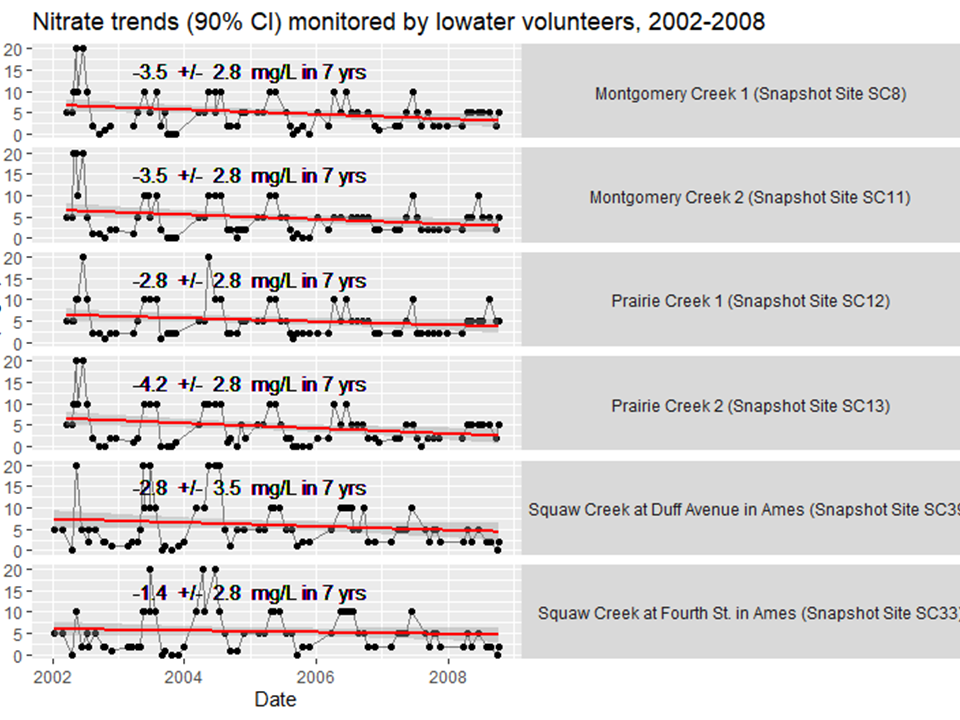
For this reason, I’ve always assumed that trend monitoring is not a realistic use for volunteer monitoring data. However, that wrongly assumed that any year-to-year trends would be small and gradual. Instead, using weekly lab data, I’ve found several big swings in nitrate over the past 20 years. It turns out volunteers with the Squaw Creek Watershed Coalition tracked some of the same trends. These six sites were sampled monthly from 2002 to 2008. Trends at three sites were even statistically significant, at the 90% confidence level.
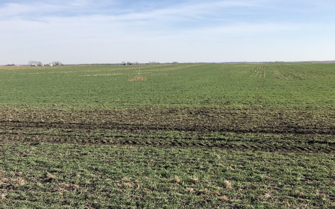
Nice looking rye cover crop near Nevada, IA November 2020
A big thank you to farmers who planted cover crops after this challenging year. Cover crops will hold soil and nutrients in place through the winter and early spring. That could be especially important this year.
After a drought, nitrogen that might normally have been taken up by a high-yielding crop or flushed away by rainfall remains in the soil. That leftover nitrogen could be available for next year’s crop, but only if:
A) we have a dry spring, or
B) farmers have made use of practices like cover crops or nitrification inhibitors that prevent nitrogen losses during the fallow season.
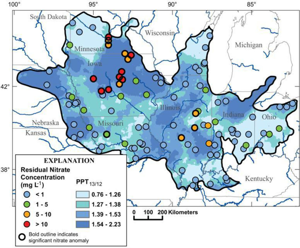
A wet year in 2013 following a dry year in 2012 (dark blue) caused nitrate concentrations in many central iowa streams to jump as much as 10 mg/L higher than usual (red). Figure from Van Metre et al. 2008
A drought in 2012 following by a wet spring in 2013 led to nitrate concentrations in excess of 20 mg/L in many rivers in Central Iowa. If we have a wet spring in 2021, we could see this happen again. As one scientific paper put it, “weather whiplash drives deterioration of water quality.”
“Weather whiplash” can also help explain the long-term trends I’ve been seeing in the South Skunk River and its tributaries: a decline in nitrate concentrations from 2005-2012, a big jump in 2013, and another decline over the past 7 years. I’ll walk you through my analysis.
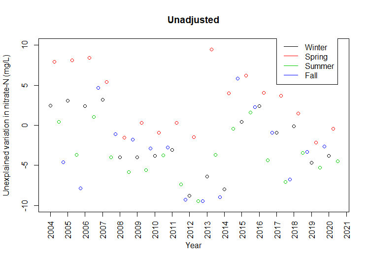
Explaining nitrate concentrations in the South Skunk River
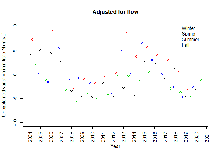
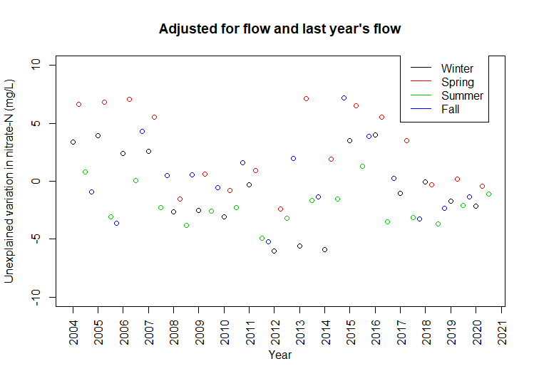
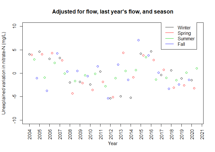
Technical details, feel free to skip: This data was collected by the City of Ames just upstream of wastewater treatment plant. The City has monitored the South Skunk River above and below its wastewater treatment plant almost every week since 2003! Flow is measured continuously at a few miles upstream USGS gage near S. 16th St. I’ve summarized nitrate concentrations and streamflow by season (Jan-Mar, Apr-Jun, Jul-Sep, Oct-Dec). At each step of the way, I apply a linear regression equation and graph the model residuals. Taken together, these three factors explain 59% of the variation. The effects of “weather whiplash” may extend beyond one year, since nitrate from some parts of the field may travel more slowly to streams via groundwater.
In a given quarter, nitrate concentrations in the South Skunk can be up to 10 mg/L higher than the long-term average, or as much as 10 mg/L lower. The following graphs show how much variation is left to explain after correcting for current weather, last year’s weather, and season.
Nitrate in the South Skunk is again declining after a sudden increase in 2013.Low-flow conditions in 2011-2013 explain unusually low nitrate concentrations.
Wet springs following dry years explain unusually high nitrate concentrations.Seasonal patterns explain some of the remaining variation.
The lowest nitrate concentrations can be explained by streamflow: when the weather is dry and tiles aren’t flowing, nitrate levels in rivers taper off to the background levels seen in groundwater.
The highest nitrate concentrations can be explained by weather over the previous 12 months: a wet period following a dry period will flush out nitrate that’s accumulated in the soil.
After that, there’s still a seasonal pattern independent of rainfall: nitrogen is most susceptible to loss in spring when soils are bare and microbial activity picks up (April-June) and least susceptible when the maturing crop is using up the available nitrogen (July-Sept).
Can some of the remaining pattern be explained by greater adoption of conservation practices in the watershed in the past 5 years? We hope so, but let’s see what happens next spring!